- Sector
- Beverage / F&B
- Location
- Indiana, USA
- Duration
- 3 weeks
- Year
- 2024
- Services
- UI/UXApp developmentFlutterDartFirebase
- Screens redesigned
- 10Screens redesignedProject scope
- Theme overhaul
- Dark → LightTheme overhaulCrimson to rose-red/white
- Font families consolidated
- 3 → 1Font families consolidatedDesign audit
Sipz with a Twist is a dirty soda and specialty beverage shop based in Indiana. Their existing app used a dark crimson theme that clashed with the brand's playful identity and made the menu hard to scan on mobile.
The app's dark crimson colour scheme felt heavy and mismatched against the bright, bubbly personality of the shop. Customers regularly complained that finding their favourite drink took too many taps.
Typography was inconsistent across screens — three different font families in use with no clear hierarchy — and the home screen carousel showed only two drinks at a time with no indication of how many more existed.
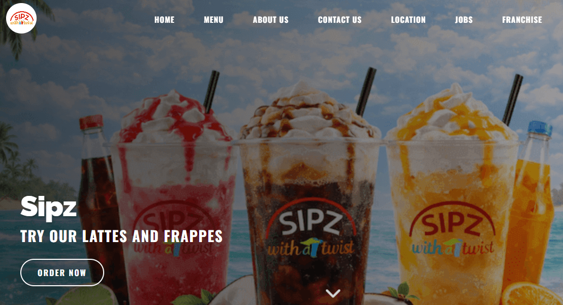
We redesigned from the ground up around a light rose-red and white theme, pulling colours directly from the shop's cup branding and in-store signage so the app felt like a natural extension of the physical experience.
The font stack was simplified to Fredoka for headings and DM Sans for body text — friendly, legible, and on-brand. The carousel became a smooth multi-item scroll with page indicators.
flutter_animate handled micro-interactions, carousel_slider replaced the manual carousel, and google_fonts removed the need to manage font files manually across ten Dart screens.
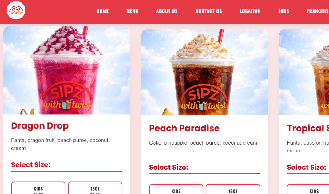
The redesigned app shipped across all ten screens with a unified design language. Staff reported fewer customer questions about how to navigate the menu, and the shop used the new UI in their in-store display as well.